Samsung -
Communication Design

The Situation: Wrong Verbal Identity
Samsung Nordics had established a bold visual identity, but the brand’s verbal identity didn’t match. It came across as cold and ‘techy’. This created two problems:
1. The ‘techy’ tone made the brand less attractive to consumers who identify as female.
2. The cold communication made Samsung feel just like any other brand, which decreases loyalty and interest among consumers.


Solution: Setting The Right Tone
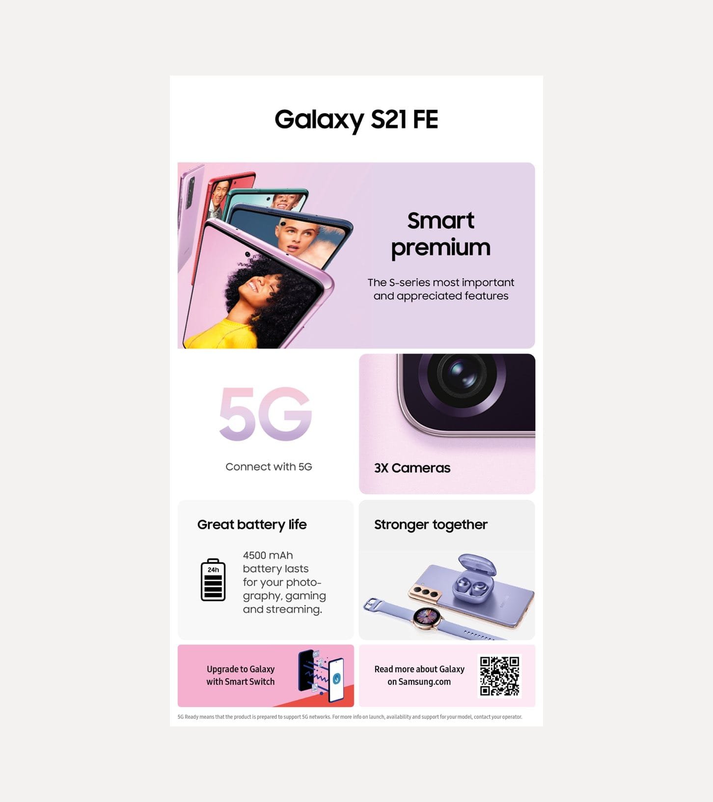
Cheil Nordic was commissioned to re-design Samsung’s store communication for their Mobile Division. The goal was to make it easier for the consumer to navigate their way through the different series and understand which device was the perfect match for them. We relied on their brand DNA as a solid foundation, and added values such as warmth/humanity and brand consistency with the overarching theme "serious tech. playfully told".


The Result:
A Clear & Simple Communication Concept
The result was a clear and simplistic design, which highlighted how the product would change the consumer's life for the better, in a more relatable and informative way.